Measuring harassment against female versus male figures
Possible for:
Twitter
Hate Speech
The purpose of this analysis is to quantify how much more or less abusive language female figures (i.e. politicians, activists, etc) receive in comparison to their male counterparts on social media.
1. Research question
Are female leaders (i.e. politicians, activists) treated with disproportionate levels of harassment in comparison to their male counterparts?2. Sample selection
- Generate a list of female individuals of interest (i.e. politicians) and a comparable list of male individuals. For example, you could select Hillary Clinton versus Bernie Sanders.
- If it is not possible to select an equal number of male and female individuals, you can weight your results during the analysis phase.
- Time Period: Select an appropriately wide time period for your given study. If you are looking at an election, we recommend looking at several months if possible.
3. Gather your data
- Gather all Tweets mentioning your specific individuals within your chosen time period
4. Classify your data
- Using your own contextual knowledge create your own codebook for a Tweet that is considered (0) not harassment or (1) harassment. If you need help defining harassment against women, see the first section of this paper for further information.
- To add another dimension to your analysis, you can look at the gender of the Tweet sender. Gender- aggregated Tweet information is not available via the API so this would require manual coding: (0) female sender, (1) male sender.
Dictionary-based sentiment analysis
-
Streamline your classification process by running a dictionary-based sentiment analysis on your dataset. A dictionary provides a pre-collective set of abusive or negative words to run against your Tweets. Python dictionaries may be available in 200 languages, but the quality varies depending on the language.
5. Analyze your data
- What are the top words used for each individual overall?
- If your team has programming capabilities, try visualizing this as a word cloud!
- Calculate the percentage of abusive words found for one politician and compare to other – is there any difference? Visualize this in a bar plot to compare!
- If your sample ends up having more male politicians than female, you will have to weight your results when comparing.
- Does abusive language change over time? Try plotting a line graph of abusive Tweet count (y-axis) over time (x-axis) for each individual and compare. Perhaps certain peaks of abusive words tell a story.
- Who is responsible for the majority of harassment against women – male or female senders?
What might such an analysis look like?
DRI conducted a similar analysis comparing Facebook comments about male versus female politicians in Pakistan: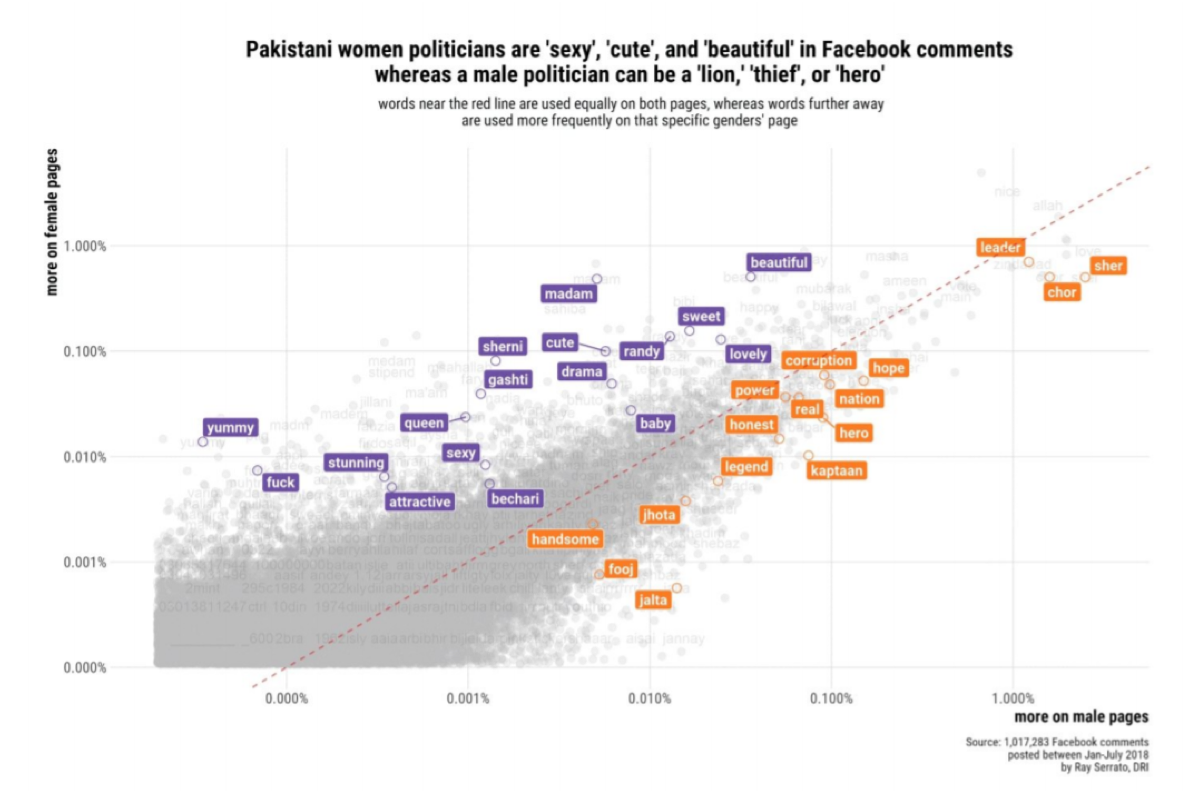
Additional Resources:
- See our other methodology to measure types of gender-based harassment on Twitter. It's also possible to use this methodology to look at user comments on other platforms.
- If you don't have access to Twitter of comment data, try measuring underrepresentation of women in media outlet's online posts.
- See DRI's Guide for more details: